Tried that. It's in the thumbnails.pd wrote:How about combining a ship and military insignia?
As menioned previously, maybe instead of using a ship one might even use a bird:
I was afraid it looked like a missile.Geoff wrote: The growth icon looks like a shield to me... and the bars under do look like military rank chevrons. Maybe try fewer bars?
Does growth *really* need to evoke an up arrow..? Yes, many things grow "up", but this isn't an absolutely essential image for the concept...
The ship icon looks like a rocket or missile more so than a ship, to me.
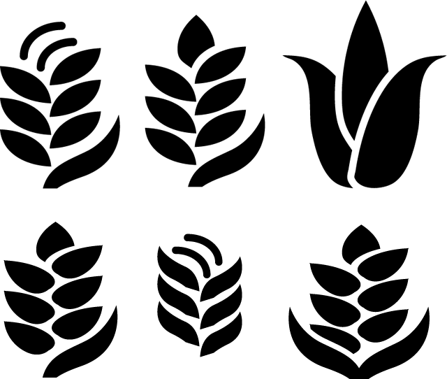
Up isn't important to me, but if it were to branch, that might be a useful depiction. I think it should look like something that (preferably) is already being used in growth, like a crop or a DNA strand. A leaf is nice but...
edit:
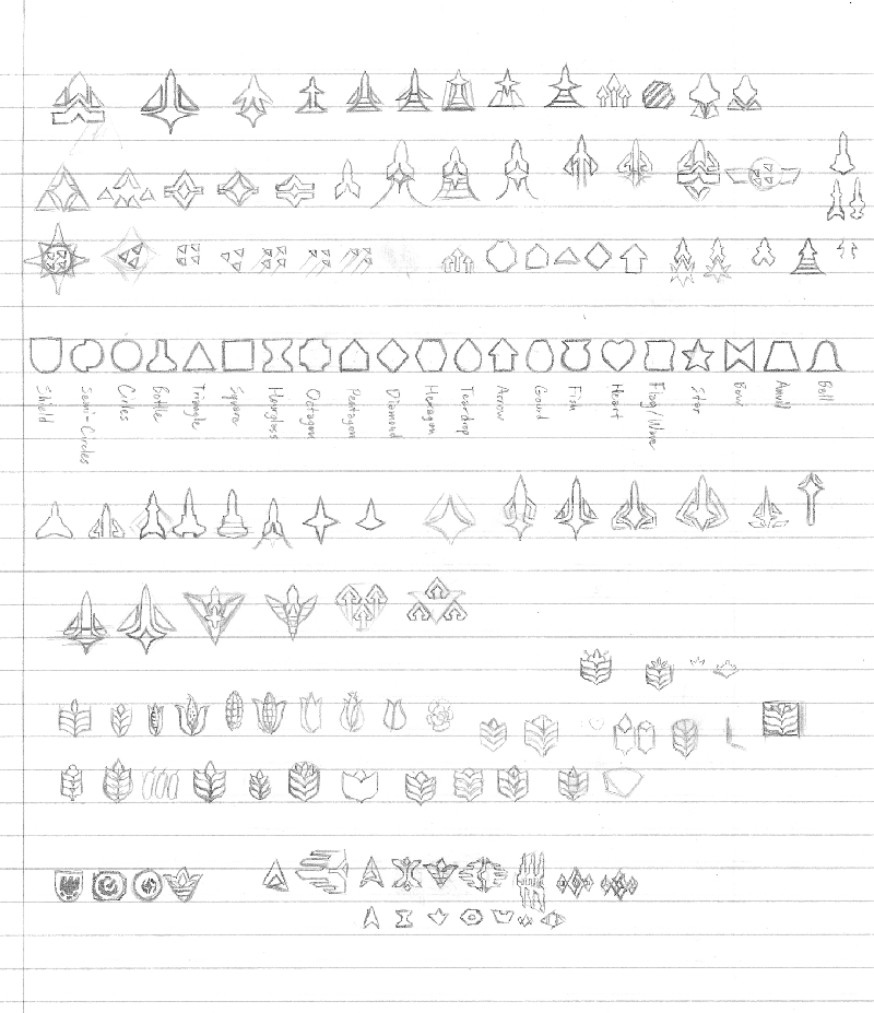
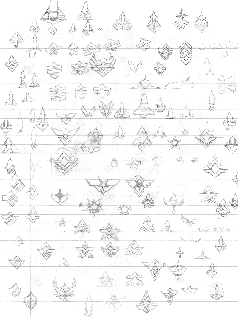
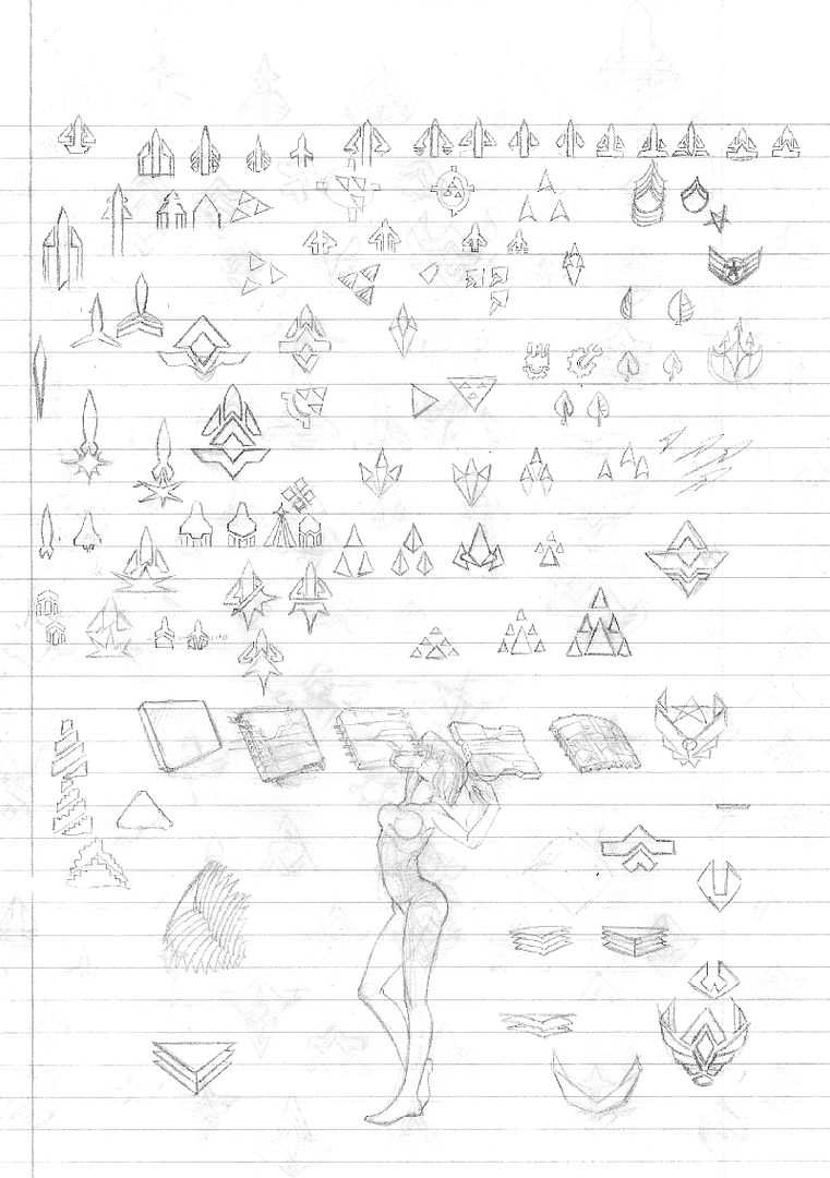
here are the scans.
I hate my scanner.