MrV's graphics mess

Development of artwork, requests, suggestions, samples, or if you have artwork to offer. Primarily for the artists.
Post Reply
Message
Author
MrV
Space Floater
Posts: 40
Joined: Mon Aug 04, 2008 3:45 pm

MrV's graphics mess

#1 Post by MrV »

Instead of cluttering up the relevant threads with any and all not-quite-done ideas I may come up with for critique, I figured I'd just as well keep a separate thread for that purpose. I'll try only posting new stuff by editing this first post, to make sure it's easy to keep track of changes etc.

First off, just a couple of suggestions for replacing the red crosses in the tech icons list. That is, Distributed Thought Computing and Orbital Factories.

Image
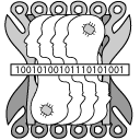
Distributed Thought. I noticed there were some suggestions for this one out in the Tech Tree thread, but figured I might as well give it a go as well. Heads with chips in them superimposed on two softened, more "organic"-ish versions of the chip graphics used elsewhere.

Image
Orbital Factories simply draw upon the style from all the other Orbital "X" icons (save "Gardens" and "Generation", which I feel ought to be changed to conform with the others) and use the factory graphic also in the Basic Autofactories icon, going for a nice constistent look.

Image
Orbital Generation redux; as mentioned above to make it conform better with the other Orbital technologies.

Image
Orbital Gardens, along the same lines as above; much improved by Josh's growth icon.

Image
I also noticed Urban Farming does not use the same wheat icon as the other icons, and was originally only going to alter that - when I noticed how good Industrial Farming looked. So I really just changed the Industrial Farming factory background to an urban skyline.

Image
Planetary Ring, pure theft from the Self-Gravitating Structures icon. I pretty much just replaced the stylized structure in center with a planet-symbol and turned the white arrows to point outwards rather than in. The dark arrows still point inwards to symbolize (and keep in line with the icon for) Space Elevators - going both ways.

Image
Temporal Mechanics looked sort of confusing, so tried to simplify and stylize it a whole lot.

ImageImageImage
The tree sizes of industrial centres. This is a rough mockup at best, just experimenting with alternate ways, moving away from the 3D/2D/complex/stylized mix.

Image
Galactic Infrastructure; made a stab at adding starlanes between the bodies, but decided this looked better. Not so sure it's an accurate enough representation of the description, but it's an idea.

Image
Deep Green. I've been twisting my brain to try and come up with something representative, original and legible for this, but it's not exactly easy :P So, this is my suggestion for icon for a money-statistics-algorithm-analyzing-computer tech.

Image
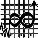
Stabilised Hypergrowth; best way I could think of to represent a graph moving perpetually straight up.
Last edited by MrV on Sat Aug 09, 2008 1:44 pm, edited 9 times in total.

User avatar
Josh
Graphics
Posts: 452
Joined: Mon Dec 31, 2007 10:49 am
Location: California, USA

Re: MrV's graphics mess

#2 Post by Josh »

Excellent. I love them both. Your distributed thought icon is the best I've seen so far, and I see no problem with orbital factories.

Fixing orbital gardens will be easy, now that we have a growth category icon and generation probably will follow soon after.

MrV
Space Floater
Posts: 40
Joined: Mon Aug 04, 2008 3:45 pm

Re: MrV's graphics mess

#3 Post by MrV »

Thanks! I've uploaded a few more now; and remember - harsh merciless criticism is the best kind ;)

User avatar
Josh
Graphics
Posts: 452
Joined: Mon Dec 31, 2007 10:49 am
Location: California, USA

Re: MrV's graphics mess

#4 Post by Josh »

For orbital gardens, just stick the growth category icon on it. I went through a lot of pains redesigning it explicitly for reasons like this, so no need to make a new icon.

Orbital generation looks fine too. I would've added an arrow on the bottom of the bolt, to make it look a little less generic.

MrV
Space Floater
Posts: 40
Joined: Mon Aug 04, 2008 3:45 pm

Re: MrV's graphics mess

#5 Post by MrV »

Josh wrote:For orbital gardens, just stick the growth category icon on it.
You mean the wheat icon? If so, that one's already been used for Orbital Farming. From the description, it looks like Gardens is more of a R&R resort kind of thing?

User avatar
Josh
Graphics
Posts: 452
Joined: Mon Dec 31, 2007 10:49 am
Location: California, USA

Re: MrV's graphics mess

#6 Post by Josh »

Lol. I knew people were gonna confuse the wheat icon for growth. No, I'm talking about the growth category icon provided for you in the FO subfolder under
C:\FreeOrion\default\data\art\icons\tech\categories

or whatever drive you choose to install FO to. It should look like this one in the upper right corner:

Image
upper right corner

I'm not really sure what Orbital Gardens are. It sounds like an extrapolation from the Babylonian Hanging Gardens, but I think the real problem is that it or some other orbital tech hasn't been aptly named. Somebody probably just made the name up as they went along, not considering the implications of having 6 techs named "orbital" or that an icon would have to be made for them.

MrV
Space Floater
Posts: 40
Joined: Mon Aug 04, 2008 3:45 pm

Re: MrV's graphics mess

#7 Post by MrV »

Oooh, wonderful! I'll switch my flower for that icon #3 right away.

User avatar
Josh
Graphics
Posts: 452
Joined: Mon Dec 31, 2007 10:49 am
Location: California, USA

Thats a big list

#8 Post by Josh »

That list got long pretty quick. You might want to focus on the ones with red X's first....

MrV
Space Floater
Posts: 40
Joined: Mon Aug 04, 2008 3:45 pm

Re: Thats a big list

#9 Post by MrV »

Josh wrote:That list got long pretty quick. You might want to focus on the ones with red X's first....
...Ooops. You're right, but it was a bit hard coming up with ideas. These currently remain (unless there are other good suggestions for them elsewhere:
-Galactic Infrastructure
-Stabilized Hypergrowth
-Colonial Economic Blueprinting
-Deep Green
-Fleet Logistics.

User avatar
Josh
Graphics
Posts: 452
Joined: Mon Dec 31, 2007 10:49 am
Location: California, USA

Re: MrV's graphics mess

#10 Post by Josh »

No worries. The wiki list needs updating to include the most recent ship icons too. When were all done with the tech icons, what happens next is the second pass: revising, reviewing and tightening of the icons so they all sit nicely with each other and read well by themselves when in game. Don't worry about the imperfect ones just yet, we need all the icons done first in order to do proper revisions (unless you have a really good idea that just can't wait, then it's okay).

MrV
Space Floater
Posts: 40
Joined: Mon Aug 04, 2008 3:45 pm

Re: MrV's graphics mess

#11 Post by MrV »

Added a few more, now Colonial Economic Blueprinting and Fleet Logistics remain. I was thinking of a planet with a gas pump sticking out of it for the latter, but that would imply you had to visit the planet for supplies - the opposite of what we're trying to say. Maybe a tanker spaceship or something could do the trick?

User avatar
Josh
Graphics
Posts: 452
Joined: Mon Dec 31, 2007 10:49 am
Location: California, USA

Re: MrV's graphics mess

#12 Post by Josh »

Whatever you think works.

If you are done with these, you can make a post in the tech icon thread containing the images you want to submit.

User avatar
Tortanick
Creative Contributor
Posts: 576
Joined: Sat May 26, 2007 8:05 pm

Re: MrV's graphics mess

#13 Post by Tortanick »

There is some really good work their! About Deep Green though, is it possible to try and have international currency symbols rather than just an American dollar?

MrV
Space Floater
Posts: 40
Joined: Mon Aug 04, 2008 3:45 pm

Re: MrV's graphics mess

#14 Post by MrV »

Josh wrote:If you are done with these, you can make a post in the tech icon thread containing the images you want to submit.
Will do, unless there's any other input on what works and not.
Tortanick wrote:There is some really good work their! About Deep Green though, is it possible to try and have international currency symbols rather than just an American dollar?
Absolutely, although more than 1 symbol could look messy. Optimally I think we should move away from terrestrial currencies altogether and just make our own, symbol and all. Problem is to be thorough enough on that point, so that there's never any confusion.

Post Reply