
I'm impressed. It's spot on except for, well you know, the textures are missing, but other than that I like it. I want to try and make some buildings soon when I get the time.
Btw, something simple and works at 16x16-thru-64x64 is preferable.
edit: It is good for a first pass, but I think the model needs harder edges because right now it just looks mushy. It could also use a lot more detail work as well, and though textures could do that, you could just as well model in all the extra detail work you need using polygons/nurbs/sub-divs without worrying about polycounts; go as high as your computer can bear.
Further, I think a whole lot of detail is going to get lost as soon as you shrink it down to size, so you'll want to consider that before tackling this particular concept as a pet project for freeorion.
Building Icons
Re: Building Icons
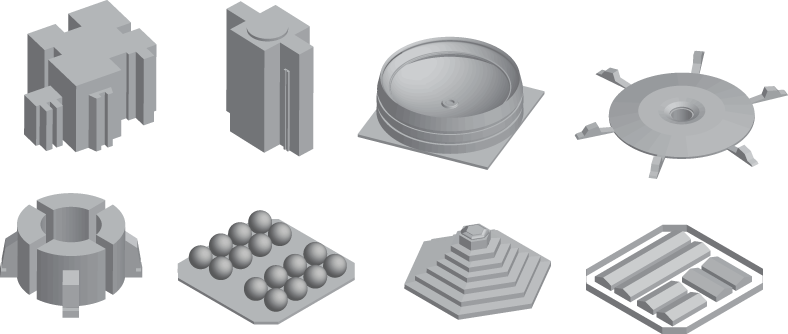
Is this close to what we want?
edit:


Here's another one that look more tech icon-ish.
Last edited by Josh on Tue Jun 16, 2009 11:19 pm, edited 1 time in total.
-
shrinkshooter

- Space Kraken
- Posts: 198
- Joined: Fri Feb 22, 2008 8:40 pm
- Location: Teh Intarwebz
Re: Building Icons
I read this thread after Geoff called my attention to it, but I can't really 'do' anything to contribute until what Josh has brought up is decided on. I'm not sure my opinion would really matter anyway, because both sides have their pros and cons and as of now the poll is at an almost even split. I'm fine with doing either photographic or iconic representations of the buildings, although if we do renders of 3d buildings we can't make them too detailed. I would actually suggest not texturing them, if they're going to be so small as an icon ingame; certainly use color, maybe specularity would matter at that size, but I don't think textures will. Could be wrong.
Either way, hopefully we'll come to a decision on this soon.
Either way, hopefully we'll come to a decision on this soon.
Photobucket account for FreeOrion and List of Techs and Icons
[[[===LEAN, MEAN, PURPLE AND GREEN MACHINE===]]]
[[[===LEAN, MEAN, PURPLE AND GREEN MACHINE===]]]

Re: Building Icons
It seems there is still a final decision needed to decide a style of those icons. As mentioned previously, I think color is a good idea, because it will help us to distinguish icons even at a tiny scale, when they are not recognizable(16x16px in the collapsed state). Similar to the ship part icons, I don't care if they're representational or symbolic, as long as they are good icons. So, I suggest the following:
Icons should:
Icons should:
- be on a transparent background
be recognizable at 48x48
be distinguishable at 16x16
have a strong, distinct silhouette
be provided in 64px*64px and in color
be representational or symbolic(choose what works best)

Re: Building Icons
Are you thinking something along these lines pd?


*The refinery was modeled by lazor, I simply textured it.*
*The refinery was modeled by lazor, I simply textured it.*
Re: Building Icons
Excellent work, commited.

I've used the refinery for "generic building" which acts as a place holder for now. Miniature sun is a beauty!
I've used the refinery for "generic building" which acts as a place holder for now. Miniature sun is a beauty!
Re: Building Icons
Interesting little doodle I made here of the astroid mining plant. At large resolution you can see seams, but I knew at smaller resolutions it wouldn't be a problem. It is what it is...


Re: Building Icons
This one needs some more work. I suggest you break up the silhouette a little. You could also play with the light setup. A simple 2 point(or even 3 point) lighting setup goes a long way. To get rid of the seam you could simply paint it over in ps/gimp/whatever using clone brush or standard brush.
Re: Building Icons
100% agree, will work on it, but nothing until the weekend most likely  But here is a sample of a black hole generator I have been working on.


Re: Building Icons
I'm sorry, I must have missed the last one. Looks good to me. Will commit when I'm back at home. Thanks!
-
GlasShadow

- Space Floater
- Posts: 32
- Joined: Mon Sep 28, 2009 8:43 pm
Re: Building Icons
here is a design im working on for the orbital gardens ... need to texture it yet and do just a bit more work

but i thought id post to get some feedback before i get it all the way done , i plan to add a green glow around it like the other ones have that kind of glowing edge look if thats ok, didnt see any specifications on if the colors have any real meaning besides, for visual, anyway i thought green, garden. the lower part with the boxer extrusions will have some engine type glow effects.
but i thought id post to get some feedback before i get it all the way done
-
The Silent One

- Graphics
- Posts: 1129
- Joined: Tue Jul 01, 2003 8:27 pm
Re: Building Icons
Looking good!
If I provided any images, code, scripts or other content here, it's released under GPL 2.0 and CC-BY-SA 3.0.
-
Thursdaybloom

- Krill Swarm
- Posts: 10
- Joined: Tue Sep 29, 2009 8:36 am
Re: Building Icons
Sounds fantastic! Can't wait to see itGlasShadow wrote:for visual, anyway i thought green, garden. the lower part with the boxer extrusions will have some engine type glow effects.
Re: Building Icons
It's very representational at this point. Some indication that this is indeed in a planetary orbit is missing. I imagine a symbolic-representational hybrid approach might work better. But I agree that green is the way to go.
When working with 3d models, please keep in mind what I've said previously about lighting. Also, don't neglect post work and consider the resolution the icon will eventually be shown, like Redcap did.
When working with 3d models, please keep in mind what I've said previously about lighting. Also, don't neglect post work and consider the resolution the icon will eventually be shown, like Redcap did.
-
GlasShadow
- Space Floater
- Posts: 32
- Joined: Mon Sep 28, 2009 8:43 pm
Re: Building Icons
yea plan to do the lighting after its textured, also i might be able to work a reflection map into the glass domes of a planet or something outer space like but ill have to play with that, also like i said some engine type effects should help convey the idea its in space. should have something a lot better looking today sometime, but i want to explore some of the UV wrapping options in max, haven't had this version long, had 6 before that, and 1.3 or 3.1 before that  cant remember as it was ages ago.


included a zip too, also i was wondering where i could find some descriptions of what these buildings are or do?
included a zip too, also i was wondering where i could find some descriptions of what these buildings are or do?
- Attachments
-
- OrbitalGarden.zip
- zip of above files
- (85.03 KiB) Downloaded 214 times