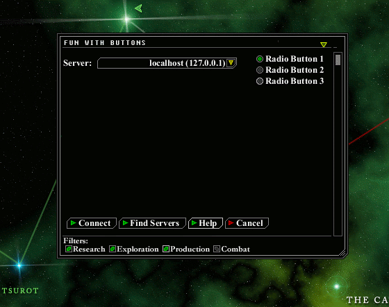
I made some UI-widgets which fit quite well with the rest of the look (I think). That means: no shadows, no raised bevels, just lines (more or less).
The controls with the brighter Border are mouse-over-effects.
I like it too. Fits quite well. The only thing I'd change is I think the combo box should stay rectanguler. The buttons and colors are just about perfect, though.
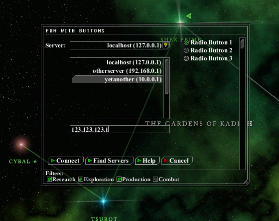
A new version:
Listbox, textfield and nicer scrollbars. I still don't like the look of the selected item in the listbox.
I also made the background semi-transparent.
The only thing I'd change is I think the combo box should stay rectanguler.
I changed the left side, but too many rectangles would make the look too boring (IMHO).