Hi,
Zach (tzlaine) has just about completed the technology screen and code, so the priority now is for the production screen. This should not be hard to design, since the way it works is similar to research. Here's a reminder from the requirements doc:
http://www.freeorion.org/index.php/V.3_ ... Production
Read through that to make sure all pertinent parts are dealt with. Just to emphasise - we need this asap. Each day we don't have the screen is a day later that the 0.3 code will be completed.
Speaking more broadly of the project - this means that most of the code for 0.3 is getting done, and soon we will be able to test it. That means we need to start bringing together soon the various portions: art, sound, and in particular the technology for 0.3.
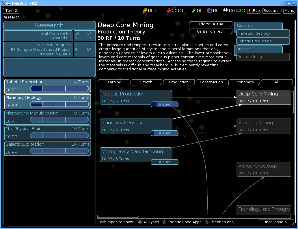
Good work on the technology screen too - here's a picture of it from the current CVS, almost complete in functionality. It's great to see 0.3 shaping up, thanks artists - and especially thanks to Zach for coding it.
http://freeorion.sourceforge.net/techscreen.png (173Kb - 1024x768)
Edit: Screenshot changed to 1024x768 (was 1152x864, but I listed the size incorrectly), and now showing second turn with some items in the queue. Zach updated the code to change button positions so the screen looks good on 1024x768.
0.3 Production Screen
0.3 Production Screen
Last edited by Tyreth on Thu Sep 22, 2005 1:56 pm, edited 3 times in total.
-
Geoff the Medio

- Programming, Design, Admin
- Posts: 13603
- Joined: Wed Oct 08, 2003 1:33 am
- Location: Munich
For the production screen, my initial reaction is that is should be a sidebar, rather than a full subscreen like the research screen. While research has the tech tree to display, I imagine production for FO would be best served by having the main map visible so as to indicate where to build things.
Then again, just a sidebar may not be enough to display everything, so it might work to have the view be essentially like the current research screen, but just show the galaxy map where the tech tree is on the research screen.
Then again again, having the system sidepanel visible while the production screen is open would probably be useful... we could drag-drop build projects onto specific planets (or the star if a project isn't located on a specific planet) on the sidepanel. So perhaps the production view could be a "top and left-side" panel, with the bottom centre of the screen left for a part-size galaxy map.

Also, when the production panel is open, we could show numbers next to systems on the galaxy map and planets on the system sidepanel to indicate the presence of something being built in the system with the relevant number indicating the place in the queue.
Then again, just a sidebar may not be enough to display everything, so it might work to have the view be essentially like the current research screen, but just show the galaxy map where the tech tree is on the research screen.
Then again again, having the system sidepanel visible while the production screen is open would probably be useful... we could drag-drop build projects onto specific planets (or the star if a project isn't located on a specific planet) on the sidepanel. So perhaps the production view could be a "top and left-side" panel, with the bottom centre of the screen left for a part-size galaxy map.
Also, when the production panel is open, we could show numbers next to systems on the galaxy map and planets on the system sidepanel to indicate the presence of something being built in the system with the relevant number indicating the place in the queue.
I know, I was just impressed that you copied it so thoroughly. Best compliment I could get I think.tzlaine wrote: Thanks, but I was just reproducing your design.
Good afternoon! This is the Earth Alliance embassy diplomatic office. My name is Alex. How may I assist you?
HUMANS! BLAUGHRAN EMPIRE CLAIMS PLANET KREIGHTON! YOU GIVE RAY GUN SCIENCE OR BLAUGHRANS DESTROY HUMANS ON KREIGHTON!!!
HUMANS! BLAUGHRAN EMPIRE CLAIMS PLANET KREIGHTON! YOU GIVE RAY GUN SCIENCE OR BLAUGHRANS DESTROY HUMANS ON KREIGHTON!!!

geoff: i also had this sidepanel idea, since we need a solution to select star systems and planets. but when having both sidepanels open, we could get some trouble with space left for the star map, so i thought about the possibilty to minimize the system sidepanel - minimized it would still allow selecting the star or planets(i thought about tiny radio buttons, instead of drag&drop) and would povide the most usefull info(meter values or something), but the planet pictures and everything else would be hidden.
-
Geoff the Medio
- Programming, Design, Admin
- Posts: 13603
- Joined: Wed Oct 08, 2003 1:33 am
- Location: Munich
Here's a quick screen real estate test with the v0.2 system sidepanel and the tech screen cap that tyreth posted with some space left for a mini-galaxy map, at 1024x768:pd wrote:...when having both sidepanels open, we could get some trouble with space left for the star map ...
http://home.cogeco.ca/~toppingwebspace4 ... teTest.png
It's not a huge amount of of space... but it's not horrendously small...
It seems necessary to discuss the system sidepanel as part of this discussion, if the system sidepanel is to be integrated into the production screen... so I'll discuss it here, even though there have been other threads (to which I link)......minimize the system sidepanel - minimized it would still allow selecting the star or planets(i thought about tiny radio buttons, instead of drag&drop) and would povide the most usefull info(meter values or something), but the planet pictures and everything else would be hidden.
To start, I'm hoping the main / standard v0.3 system sidepanel is somewhat thinner than the v0.2 version... This would free up a bit more space for the galaxy map in the linked image.
IMO we should really think and justify any information we put on the system sidepanel: Does it really need to be there? Will it be useful very often for the player to have this info accessible with one click, or would two clicks be ok?
The most recent mockups for the system sidepanel:
viewtopic.php?p=16741#16741
viewtopic.php?p=16771#16771
Both are too wide, IMO. I made a mockup to illustrate this point:
viewtopic.php?p=15946#15946
To make the sidepanel thinner, we could have:
1) Taller and thinner info boxes for each planet, thus making the whole panel thinner, leaving more room for galaxy view, whether a production panel is open or not.
2) Various tabs in the system view to switch between different displays of different sorts of information on the system panel. If you're looking at the system view for resource production info, you'd switch to the resources view, and it would display meter values and population and resource production of the planet and relevant specials. If you're looking at the system for defensive purposes, the relevant info would be displayed. Same for buildings info, or whatever else is necessary... maybe politics / culture / espionage, etc. In some cases, there might not need to be separate boxes of info for each planet.
Re: radio buttons:
I'm not sure what you mean by this... Radio buttons are usually a UI element with which you pick one from a group (which is ok) but which stays visible after your selection, allowing you to toggle / switch between options quickly... which doesn't really fit the idea of picking a place to build something, to me... If it's anything like the focus selection on the individual planet view, I'm not too keen... Can you explain / illustrate?
Re: planet pics on sidepanel / reduced scale version for production picking:
Despite all my talk of only showing what's important, IMO the planet picture and name are top priorities to show. I think the system and indvidual planets are best identified by a combination of planet name and planet appearance... meaning the image like we have on the sidepanel now. This could be reduced in size a bit maybe... esp. if it's rendered as I heard talk of possibly happening... but it should be there.
In general, some way to indicate what else of note is located on a particular planet might be good... ie. other buildings or specials, and a highlight / greying out to indicate whether the planet is a valid build location for things that have special requirements (if that's even possible in v0.3, I'm not sure...).
Before we can really decide what we need to show on a system sidepanel in general, or during production specifically (if different), we need to know what the player would need to know in order to decide where to build something... That probably means we need to know what sorts of things we'll be using to activate building effects groups... and what other ways buildings effects groups will be commonly modified by planet or system properties.
This is a rather complicated set of issues. It might help to get some more input on the forgotten aspects of the buildings model that we neglected whilst focusing on the effects stuff. I had a thread going and some wiki stuff that didn't get terribly much attention... but perhaps it can now?
viewtopic.php?t=991
I'm still waiting for more info about events from tzlaine, but the non-tech prerequisites for buildings at particular locations is relevant to this discussion... If we have them, which we should IMO, we'll need to show what buildings are already at or within some distance of a given location...
Perhaps we could have some marker on a system or planet that indicates for each effects group whether its activation condition is met by the particular build location...
I think this post is more than sufficiently rambly for now.
Events are not going to make it into v0.3. The rough idea behind them atm is that they will be like specials, but with a duration. The duration may just be X turns, or it may be until some condition is met or something like that.Geoff the Medio wrote:I'm still waiting for more info about events from tzlaine, ...
-
Geoff the Medio
- Programming, Design, Admin
- Posts: 13603
- Joined: Wed Oct 08, 2003 1:33 am
- Location: Munich
In that case, I'll assume that most (but not all...) of the rest of the stuff on the Buildings Model Quickpad wiki page isn't going to be in v0.3 as well.tzlaine wrote:Events are not going to make it into v0.3.
However the non-tech building prerequisites stuff is rather important... especially in order to design the relevant UI, so I'd like that part at least to be approved / implemented if possible.
Assuming that happens, we need the production UI for buildings to display the following sorts of information, which might determine where a player would want to place a building, and whether they are able to do so at a given location:
... This is pretty much all the info we display on the sidepanel anyway, with the addition of the presence of buildings and specials stuff. Perhaps it would work to have a separate tabs... one to show the planets with a list of buildings and specials, and one to display the meters/focus/environment etc, like we have now.
When picking a build location, each planet on the sidepanel should be greyed out or highlighted to indicate whether it is acceptable. Similarly, each system on the galaxy map should be coloured or shaded or indicated with an icon or outline of some sort to indicate whether there is at least one planet in the system at which a selected building can be built (or that the system itself is a valid build target, if possible).
Additionally, some visible radius shading / outline on the map should be visible to indicate the range of buildings with effects groups that have a range. We might want to add a "range" property to buildings that's separate from the individual effects groups, however, to simplify this or remove any possible ambiguity.
We also need the production building info panel (right half of top left box in little mockup I made earlier) to indicate the requirements for a building to be built at a particular location, in addition to building effects summary, text description, etc.
For buildings that are limited to X per empire or Y per universe, we could grey them out or remove them from the list of available build projects.
Which reminds me... we need some space on the production screen to list the available build projects. There's not terribly much space left in the mini-mockup or screen real-estate test...
Perhaps this could be displayed over top of the galaxy map area, like a menu with subcategories or several menus (broken up by building, ships, misc., then type of building, type of ship etc.). This menu would be reduced to just a single button: "Build", until clicked, then it would open up like the windows start menu (or any other menu), then disappear after the player makes a selection, like running a program from the start menu, except this would just select a building type, putting it's info in the building info panel. If the player then clicked on an appropriate planet / system, the buidling would be enqueued. Right clicking would cancel the build order.
I acknowledge that we might want to change the way buildings are available for production, such as limiting the number of them that can be built at one location, etc., but I want to push that back to after v0.3.Geoff the Medio wrote: Before we can really decide what we need to show on a system sidepanel in general, or during production specifically (if different), we need to know what the player would need to know in order to decide where to build something... That probably means we need to know what sorts of things we'll be using to activate building effects groups... and what other ways buildings effects groups will be commonly modified by planet or system properties.
This is a rather complicated set of issues. It might help to get some more input on the forgotten aspects of the buildings model that we neglected whilst focusing on the effects stuff. I had a thread going and some wiki stuff that didn't get terribly much attention... but perhaps it can now?
viewtopic.php?t=991
I think this will be alot easier if we break down what exacty the production screen is supposed to do. Right now, all I think we need is:
1) a list of all buildings that can be produced, with details on each
2) a list of all ships that can be produced, with details on each
3) when a building type is selected, a map overlay indicating the systems/planets at which it is legal to produce that building (for v0.3, that will be any panet/system)
4) when a ship type is selected, a map overlay, or perhaps just some icons on the map, indicating where the shipyards are, so it can easily be determined where ships can be built (for v0.3, all planets/systems will have shipyards)
5) a means of selecting a production location (e.g. by clicking on a system, then on a planet in the sidepanel, though maybe somthing else?)
6) a list of all things (both buildings and ships) that can be built at the selected location
7) an overlay on the map window that shows the area of effect for a buiding that you want to build at the place you've selected, incuding zones of interference with other non-stacking effects-groups (perhaps a two-color style interaction, in which the first color means that the indicated region will be affected, and the second coor means that the indicated region will have no effect, due to stacking limitations and effects from other buildings?)
8 ) an overlay on the map window indicating fleet strength, which should help deciding where to place ships
This should allow the user to build a ship or building by first selecting the one she wants, and then selecting where it is possible to build it, or to select a location and then see what is available for production at that location.
Can anyone else think of any major functionality the production screen needs?
After we determine what should be done in the UI, we can figure out how to ay it all out. And by "we" I mean "not me", given my artistic abilities.
Well, Geoff, it looks like we just cross-posted each other. But let's keep the decisions on where to place things, etc. until after we've gotten the requirements together.Which reminds me... we need some space on the production screen to list the available build projects. There's not terribly much space left in the mini-mockup or screen real-estate test...
-
Geoff the Medio
- Programming, Design, Admin
- Posts: 13603
- Joined: Wed Oct 08, 2003 1:33 am
- Location: Munich
Another thing we might want is the ability to indicate how many of a certain type of ship to build. This should be doable without the keyboard, if possible.
I'm not sure that a (separate) list of things that can be built at a particular system is necessary... However we could have the process work both ways, getting the same effect with no extra space.
By this, I mean we've (or I've) mostly been assuming the process will be
Player picks thing to build -> UI indicates valid build locations -> Player picks build locatin -> UI adds item(s) to queue
However we could also allow this process:
Player picks build location -> UI indicates things that can be built -> Player picks thing to build -> UI adds item(s) to queue
In both cases, the same UI element to list the available build projects could be used. In the pick-location-first scheme, the list would be filtered to only show things that can be built in the selected location.
In both cases, the above suggested start menu style list could be used... or we could have an always-visible one-click list, if we have space to do so.
Are you restating what I suggested above, or was it not clear that this is what I was saying too?Geoff the Medio wrote:Another thing we might want is the ability to indicate how many of a certain type of ship to build. This should be doable without the keyboard, if possible.
I'm not sure that a (separate) list of things that can be built at a particular system is necessary... However we could have the process work both ways, getting the same effect with no extra space.
By this, I mean we've (or I've) mostly been assuming the process will be
Player picks thing to build -> UI indicates valid build locations -> Player picks build locatin -> UI adds item(s) to queue
However we could also allow this process:
Player picks build location -> UI indicates things that can be built -> Player picks thing to build -> UI adds item(s) to queue
In both cases, the same UI element to list the available build projects could be used. In the pick-location-first scheme, the list would be filtered to only show things that can be built in the selected location.
In both cases, the above suggested start menu style list could be used... or we could have an always-visible one-click list, if we have space to do so.