0.4 combat UI

Development of artwork, requests, suggestions, samples, or if you have artwork to offer. Primarily for the artists.
Message
Author
User avatar
eleazar
Design & Graphics Lead Emeritus
Posts: 3858
Joined: Sat Sep 23, 2006 7:09 pm
Location: USA — midwest

Re: 0.4 combat UI

#46 Post by eleazar »

Josh wrote:What I get from your post is we should have 2 bars:
Yes, though theoretically the two bars could be placed end-to-end, but i expect that would make them too long.
Josh wrote:...green for hull points and blue for shield points? I would also venture further to say red for damage (instead of black or grey), but how about a darker blue for depleted shields?
The colors were just examples, i haven't done any mock-ups.

Josh wrote:...because if I recall correctly, nobody in the entire MOO series thought to put floating health bars directly next to the units. They always just put them at the bottom of the screen or something. Maybe because floating health bars look funny?
I Haven't' played MoO3, but for the turn-based MoO2 there's not as much benefit it putting the bars up by the ships, since one thing happens at a time, and you can check the stats whenever you want. Maybe MoO3 stuck with the format from inertia.

Josh wrote:...Would something like these be appropriate for FO? I don't mean the gifs themselves, and I do mean in lieu of health bars floating right over the units.
I think something like in both your examples would be cool and useful, but i don't think it can replace health/shield bars. It seems exceedingly hard to apply battle damage decals to all the various sizes of ships in such a way that you can tell the difference between 25% hull and 50% hull.


I imagine there would be a key to toggle between two ways of displaying the hull/shield bars.
1) cinematic: bars only displayed for selected ships and/or any ships under the mouse.
2) tactical: bars are displayed for all ships you can see.


Also looking at the top of the previous page, i'm a little concerned that were using such elongated ships for all the mock-ups. A round ship for instance would look rather tiny in such a space, or even more so a tall ship like a star wars B-wing. If all our ships are going to be elongated then there is nothing to worry about, but as far as i know there's not been a conscious decision that this will be the case.

User avatar
utilae
Cosmic Dragon
Posts: 2175
Joined: Fri Jun 27, 2003 12:37 am
Location: Auckland, New Zealand

Re: 0.4 combat UI

#47 Post by utilae »

Josh wrote:This next post is related to Design: Battle Math

Integrity Bar
If you haven't browsed the battle math discussion yet, this post will be incomprehensible to you. Fair warning. Right now it looks like there is an agreement that ships are going to have to keep track of hull points and shield points somehow, and I believe that some visual cues are in order. I'll just call this section of the UI the Integrity Bar.

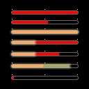
For the Integrity Bar, and I'm sure I've heard this somewhere else, one bar could be just enough for hull and shields. to test this theory, both shields and hull points are represented superimposed over each other in the example below, with an opaque red bar representing hull points and a bright, translucent yellow screen layered on top of it to represent shields. You have tick marks and a gray border to keep track of the lengths as well.
With that in mind, try to decipher this example.

Demonstration
Image


From top to bottom:
1) Ship is in full repair without shields.
2) Hull is damaged.
3) Ship has full hull and shields.
4) ship has full hull and some shields.
5) Hull is damaged and partly shielded.
6) Shield integrity is higher than hull integrity.
7) Showcasing the tickmarks and grey containing border.


When you select a ship (or planet), this single meter appears above it.
The idea is that you need to keep an eye out for grey and black, as they denote damaged ships (or planets). You also might want to take into account the "pink", as they denote shields and hull at the same time. Another item that's not obvious in the demonstration is the translucency of the shield bar. You can actually see straight through to the background when looking at the grey part of the bar (it's actually a bright yellow at 66% opacity).
That is pretty good. I would imagine that with this, when the shield bar (covers hull bar) goes to zero, then the hull bar is shown. Of course, when a weapon hits the ship, and the damage goes to the shields or hull, then the appropriate bar can be shown at that time, as well as the floating damage value. Eg if a weapon hits and damage goes to the shields only, then the shield bar can be shown and depleted.

User avatar
Josh
Graphics
Posts: 452
Joined: Mon Dec 31, 2007 10:49 am
Location: California, USA

Re: 0.4 combat UI

#48 Post by Josh »

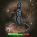
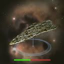
Here's the simplest way I know to represent hit points. We can use bright blue and green for shields and hull, and then darker duller colors such as red as they take damage. The bars are ugly and uncreative by my standards, but they tell you what you want to know.

Image
shield damaged with orange indicator showing the amount

Image
shield damaged, but showing blue instead

Image
no shields

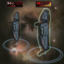
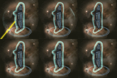
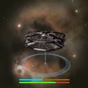
Second, for variety, damage bars as opposed to health bars. What I quickly discovered was that damage bars are not really a good way to represent shields, so I used auras for them. The system tells you pretty quickly which ships are still able to fight and which ones need a break, though my gripe is that the halos/auras are a little obtrusive. I couldn't find any other (good) way to make it work.

Damage Bars and Shield Halos
Image
The damage bar only pops up and draws attention if a ship gets damaged, otherwise all you see is a shield halo (if the ship has shields). The little number in the upper left shows the percent efficiency lost to damage.

Shield Halo
Image
It's an aura that intuits the amount of shields a ship has. The gif shows the halo losing and then regenerating it's shields; a bigger halo means strong shields, and a smaller halo means weak shields. Simple. I'm assuming this is all you want to know about a ship's shields at-a-glance.
If you want to know anything else about a ship, you have to select it/query it/highlight it/whatever.

User avatar
General_Zaber
Space Kraken
Posts: 130
Joined: Wed Jan 09, 2008 6:43 am
Location: Iserlohn Fortress

Re: 0.4 combat UI

#49 Post by General_Zaber »

I love the Shield Halos, the bottom .gif shows exactly what I'd love to see in FO. However it would be nice if the Shields bar idea can be visible ie. Off by default but can be switched on either tactically or cinematically (always there / only on selected, respectively) That way if people prefer a bar for it they can still have one.
The enemy is retreating! As always, there is no cuteness about them. Dammit

User avatar
Bigjoe5
Designer and Programmer
Posts: 2058
Joined: Tue Aug 14, 2007 6:33 pm
Location: Orion

Re: 0.4 combat UI

#50 Post by Bigjoe5 »

My problem with the shield halo is that while it tells you how much shields you have left, it doesn't tell you what percentage of shield you have left. I'm assuming of course, that the best shield reduced to the strength of the most basic shield will look the same. Is that right? In that case, I like single combination shield/hull bar (don't like the colors though; I'd go for green and blue, then a dark red where there's nothing, but I guess that was just a quick mockup), in addition to the halo. Between those two, you can pretty much find out whatever you need to know about a ship's health at a glance.
Warning: Antarans in dimensional portal are closer than they appear.

User avatar
eleazar
Design & Graphics Lead Emeritus
Posts: 3858
Joined: Sat Sep 23, 2006 7:09 pm
Location: USA — midwest

Re: 0.4 combat UI

#51 Post by eleazar »

Josh wrote:Here's the simplest way I know to represent hit points. We can use bright blue and green for shields and hull, and then darker duller colors such as red as they take damage. The bars are ugly and uncreative by my standards, but they tell you what you want to know.

Image
shield damaged with orange indicator showing the amount

Image
shield damaged, but showing blue instead

Image
no shields
These are very good, though i think a blinking segment might do better than orange to indicate damage just done. The light blue should be pushed further away from green to keep the two bars distinct.
A stroke of black or dark grey is probably needed to help keep them from blurring into bright or busy backgrounds.

BTW "simple" does not equal "ugly".

User avatar
francys
Space Squid
Posts: 54
Joined: Sat Oct 25, 2008 8:53 pm
Location: Victoria, BC

Re: 0.4 combat UI

#52 Post by francys »

The design seem really nice and easy to understand.
However I noticed a certain resemblance to the bars in Dark Orbit... anyone? :mrgreen:

User avatar
eleazar
Design & Graphics Lead Emeritus
Posts: 3858
Joined: Sat Sep 23, 2006 7:09 pm
Location: USA — midwest

Re: 0.4 combat UI

#53 Post by eleazar »

francys wrote:The design seem really nice and easy to understand.
However I noticed a certain resemblance to the bars in Dark Orbit... anyone? :mrgreen:
Haven't played it.

But Health (and other stat) bars are basic and really common. No doubt dozens of games have done something very similar.

User avatar
Josh
Graphics
Posts: 452
Joined: Mon Dec 31, 2007 10:49 am
Location: California, USA

Re: 0.4 combat UI

#54 Post by Josh »

Yeah that's about the gist of it.

Everything you need to know in two bars. I'd say that's a pretty hefty accomplishment, don't you agree? I'm going to treat myself to a cup of.... no wait I still have work to do. Never mind.

User avatar
pd
Graphics Lead Emeritus
Posts: 1924
Joined: Mon Mar 08, 2004 6:17 pm
Location: 52°16'N 10°31'E

Re: 0.4 combat UI

#55 Post by pd »

I've done some exploratory sketches for space combat. They are a mix of mood painting and UI preparation - basically just getting some ideas out.

Image
Image

If you have any idea's about what kind of scenarios could/should be explored, I'm eager to hear them. I'd like to depict a combat situation, but I'm still not certain how combat actually plays out and what there is exactly to do for the player.

User avatar
Geoff the Medio
Programming, Design, Admin
Posts: 13603
Joined: Wed Oct 08, 2003 1:33 am
Location: Munich

Re: 0.4 combat UI

#56 Post by Geoff the Medio »

pd wrote:[What] scenarios, [can] occur in space combat? What kind of situations will the player have to deal with? What kind of decisions will he have to make? I know that the ship's positions relative to each other will play a big role, but everything else is still quite blurry to me.
There are various different and somewhat independent factors that will add up to define a combat situation. Rather than giving a few specific scenarios, here is a bit of a brain dump such factors. Let me know if this is helpful or not or what else to discuss...

General Combat Force Composition:
* Either player could have a large battle fleet with multiple ships of each type in mixed or homogenous groups in a system where a combat occurs.
* Either player could have one or two weakly armed scout ships, or other non-combat ships.
* Either player could also own planets in the system, which may or may not have weapons and defenses.

Battle Scenario:
* Field Battle - Two players' have battle fleets that arrive in an otherwise empty system on the same turn. They are at war, so they have a battle, with both fleets starting at starlane entry points... (possibly the same one, if they arrive by the same starlane?)
* Assault - One player has a fleet or planets and fleet in a system that have been there since the previou turn, and another player has a fleet arrive in the system. The defending player's fleets start anywhere in the system. The arriving player's fleets start at starlane openings and attempt to do bad stuff to the already-present player.
* Passive Attrition (?) - Not sure if it should be possible, but if two empires have no armed ships, but do have battle-capable planets, they could have a fight.
* Continuation - If we have time limits on battles, and a battle ins't resolved by the end of the available time on a turn, the battle could just resume where it left off next turn. Any ships arriving via starlane would appear at the start of the battle, and ships or planets present at the end of the previos turn would remain.
* Transit - One empire's forces are in a system, and another empire's forces are arriving at the system, but don't want to stay there or accomplish anything there, but rather just want to pass through. The already-present forces might be blockading and trying the prevent the passers by from moving from one starlane entry point to another.
* Escape - Similar to transit, except the the empire whose ships want to depart also start in the system and attempt to get to starlane entrances to escape.

Targets:
* Combat Ships - Destroying enemey combat ships is always nice...
* Strategic Mission Ships - Expensive / Important ships in a system where a battle is happening that aren't very useful during the battle. A goal for a battle could be to destroy such ships.
* Planets - Much like strategic ships, planets are obviously strategically important targets to attack or prevent from being attacked, presuming that battle damage or contact with enemy ships during a battle is of some significance long-term.
* Buildings - Any building that is described as being in space, around a planet or elsewhere in the system. Includes megaprojects or shipyards or asteroid mines.
* The Star - Some ships might have some bad or good effect if they can reach the star of a system during a battle.
* Neutrals - Presumably we'll populate the universe with a few other interesting neutral objects that might be targets to attack or defend during battles, much like owned planets or the star or megaprojects.

Starting Locations:
* Any ships arriving in a system via starlane have to start at / near those starlane's entrances on the battle map.
* Any ships already in a system when a new battle is starting have to be positioned in the system. Exactly where they can/can't be posisioned isn't decided, but probably they should have to start away from starlane entrances. Perhaps near owned planets?
* If there is a battle continuation, ships start where they were at the end of the previous turn's battle time.

Tactics:
* Grouping - Players have a set of ships or fleets available in a battle, but need to decide how to group these together during the battle. Perhaps task groups can be preconfigured, or we'd just let the players make RTS control groups after battles start?
* Ship Movements - Players can order ships or groups of ships to move around the map, to get closer or get away from other objects, or move into range or out of range, or to avoid detection, or search for hard-to-detect enemy objects. Or, ships can be ordered to stay put.
* Weapon Use - Ships and fleets might have multiple weapons available. There should probably be a way to disable and reenable ships from using particular weapons, indvidually or groupwise.
* Targetting - Ships can be given a target object or group to act appropriately towards
* Stance - Should ships or groups of ships close in to use their shorter range weapons or try to stay far enough away to avoid enemies' weapons?
* Detection and Stealth - Ships have a detection rating that sets a maximum distance they can see anything that's trying to be stealthy. (Some things are always visible, regardless of distance, including planets, stars and some ships). Stealth reduces the distance at which an enemy ships can see the stealthy ship. Unseen ships can't be targetted.
* Scouting - If the enemy is stealthy or you have poor detection, sending ships around the system helps determine where enemies are located.
* Terrain - Asteroid belts or gas coulds in a system might have significant effects on shield strength or weapon range or ship speed. Ships being "in orbit" (within a disc around a planet) could have some tactical advantages and disadvantages.
* Screening - Point defense (PD) ships protect others against missiles or fighters, so it's helpful to keep the PD ships between fighters and other ships.
* Sacking - Short range (SR) ships can get in close and do a lot of damage to other ships that lack SR weapons.
* Sniping - Long range (LR) missiles can be lobbed from relative safety by ships that have them at planets or ships that don't.
* Carriers and Fighters - Can move around in a group like a ship or group of ships, can attack or be attacked. Leaving a carrier without any fighters could make it quite vulnerable to being attacked by SR or enemy fighters.
* Bombers vs. Interceptors - Bombers are good at attacking ships and planets, interceptors are good at attacking bombers and missiles.
User avatar
pd
Graphics Lead Emeritus
Posts: 1924
Joined: Mon Mar 08, 2004 6:17 pm
Location: 52°16'N 10°31'E

Re: 0.4 combat UI

#57 Post by pd »

Wow, this is excellent, exactly what I need. Thanks a lot.

tzlaine
Programming Lead Emeritus
Posts: 1092
Joined: Thu Jun 26, 2003 1:33 pm

Re: 0.4 combat UI

#58 Post by tzlaine »

The only thing I'd add to Geoff's very comprehensive post is that we've talked a lot about shipyards, and the strategic importance of them. It's not settled yet, but it seems pretty likely that they'll be available as independent targets.

User avatar
Bigjoe5
Designer and Programmer
Posts: 2058
Joined: Tue Aug 14, 2007 6:33 pm
Location: Orion

Re: 0.4 combat UI

#59 Post by Bigjoe5 »

I'll add one little detail to that if I may: Since battles are system wide, there will be battles with more than two empires. This means there needs to be a way to distinguish between empires, not just friend/foe (though if colour is being used to distinguish between empires, a creative, non-colour dependent way of distinguishing friend from foe may be useful). Also, this means that a valid combat goal could be to assist one's ally in achieving one of the goals Geoff mentioned, such as escape, transit, etc. without actually wanting to get any of your own ships anywhere.
Warning: Antarans in dimensional portal are closer than they appear.

User avatar
MikkoM
Space Dragon
Posts: 318
Joined: Fri Mar 10, 2006 12:32 pm
Location: Finland

Re: 0.4 combat UI

#60 Post by MikkoM »

Just a couple of aesthetics questions, probably not that important in this stage anyway.

Could the planetary orbitals be presented, not linked to each other and possibly a little further away from the planet? And could the planetary shield be made transparent so that you could see the whole planet underneath it? This way you would hopefully be able to enjoy the planetary graphics, the planetary shield and the orbitals all at the same time, without one of them limiting your view of the other.

Post Reply