How about: 1 + 2 = 3) All enemy ships have generic / less informative symbols by default, but the player can override these and define their own set of symbols when so-inclined...?eleazar wrote:
- 1) The player would have to set up a system of symbols to define all ships (which is a complex preference setting, or
2) all enemy ships would be represented by a much less informative set of symbols— perhaps only size is displayed
0.4 combat UI
-
Geoff the Medio

- Programming, Design, Admin
- Posts: 13603
- Joined: Wed Oct 08, 2003 1:33 am
- Location: Munich
Re: 0.4 combat UI

Good
#2 sounds great. Size is the only ship constant I can think of, and we need default symbols, period. #1 is a bad idea: lets keep complexity away from the average player as much as possible unless it's really important, like race or galaxy set up. I have a slightly more KISS idea that could work.
Everything else changes too much, so unfortunately I can't see roles being interpreted with any reliability.
Here's what I think the symbols need to do:
1: (Empire) Color should represent the side a ship is on.
2: Symbols should simplistically, clearly distinguish between 6 different sizes which are........ Actually I'm not sure exactly what they are, but they'll need to. (are fighters a ship size?) Simply expanding a single dot isn't good enough, because there are 6 phases it would have to go through.
3: Different shapes represent roles, but I have no idea what roles could be. We should find other games that tackle this problem.
So here's the KISS idea: Remember space Empire and MoO3 forced the user to categorize all their ships? Every ship fell into a distinct category; it was either an attack ship, or a carrier, or a transport or a missile boat, so my thought is why don't we force ship classification? Then we can assign icons to designated ship classes.
So here's 4 classes, and they could have an icon:
Small ship design
} ____ Point defender (Small)
> ____ Battleship (Small)
x ____ Missile Ship (Small)
o ____ Carrier (Small)
And when you change to a larger or smaller hull, the icon changes (somehow) accordingly to represent that:
Large ship design
}} ____ Point defender (Large)
<> ____ Battleship (Large)
X ____ Missile Ship (Large)
(O) ____ Carrier (Large)
Enemies (automatically taken care of)
Radar map
}} ____ Point defender (Large)
<||> ____ Battleship (Absolutely Gargantuan)
X ____ Missile Ship (Large)
o ____ Carrier (Small)
The design screen should list the respective icon next to the classification for ease of use.
This all reminds me of emoticons
(I hope you won't mind tweaking the ship design UI)
-
marhawkman
- Large Juggernaut
- Posts: 938
- Joined: Fri Jan 20, 2006 9:34 pm
- Location: GA
Re: 0.4 combat UI
I wouldn't worry about distinguishing between icons of differing players. That's easily fixed by making the icons only have 1 or 2 colors. The main color of the icon being the player's color.
SE allowed you to make up your own ship types. I think that would be good here, we could also make it so the game associates (custom or stock) icons with each ship type (including your custom ones). So you'd need to tell the game what icon to use for your ship type when you create it. If you don't feel like it you could just let the game default to the icon for "speedbump".
SE allowed you to make up your own ship types. I think that would be good here, we could also make it so the game associates (custom or stock) icons with each ship type (including your custom ones). So you'd need to tell the game what icon to use for your ship type when you create it. If you don't feel like it you could just let the game default to the icon for "speedbump".
Computer programming is fun.
-
eleazar

- Design & Graphics Lead Emeritus
- Posts: 3858
- Joined: Sat Sep 23, 2006 7:09 pm
- Location: USA — midwest
Re: Good
Of courseJosh wrote:Here's what I think the symbols need to do:
1: (Empire) Color should represent the side a ship is on.
We don't exactly have a concept of "roles" in the game. Obviously some ships are better at some things that at others— but these won't necessarily fall into a predefined set of "classes" or "roles"Josh wrote:2: Symbols should simplistically, clearly distinguish between 6 different sizes...
3: Different shapes represent roles, but I have no idea what roles could be. We should find other games that tackle this problem.
So modifying this to take everything into account:
1) color represents empire
2) the "hull" is generally the most significant single aspect of a ship. Each hull type would have a distinct graphic, of a simple geometric nature, which would also indicate size.
3) the player when designing a ship could choose between different variants of that graphic that matched the hull to indicate in his way whatever distinguishing feature the ship has.
Thus the player has a reasonable amount of control but doesn't have to relearn or remake an icon system for each game. The enemy's ships can be displayed up to #2 without any conflict with the player's own system of identification,
Re: 0.4 combat UI
I can design the icons, I already have something in mind. Anything you want to tell me before I mock something up?

Re: 0.4 combat UI
Until the first mockups for the UI are going to be developed, this is basically just like brainstorming here. So yes, feel free to mock up some icons.
Argh, MS paint
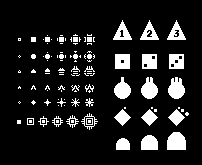
Assembly lines & methodology
the left most ones are very hard to see, they are not important. Rather they are results of what could be size progression from one shape. The symbols on the right highlight different approaches of expressing size.
Variation
These forms are essentially formed from one shape; a triangle. This is an attempt at showing how dramatically one geometric shape can vary.
Does any of this make sense?
-
marhawkman
- Large Juggernaut
- Posts: 938
- Joined: Fri Jan 20, 2006 9:34 pm
- Location: GA
Re: 0.4 combat UI
I like the development of the tiny ones a lot. They actually aren't hard the see/read. Nice triangle variations as well.
Re: 0.4 combat UI
Something I wanted a little clarification for;
My idea was that we would have a set of broad, predefined roles that had an icon to each of their names. The roles themselves wouldn't mean anything, the player would just arbitrarily designate what role their ship they think it should fill, and that would also determine the icon. Thus, it wouldn't matter which player had the ship, the computer and other players could still tell what it (basically) is.
I can imagine players building a planet killer and designating it a colony ship for kicks though...
So let's say a the player is in the design screen and he/she is building a doomstar that launches fighters and one that blows up planets and one that does something really unique, like disabling retreat for the enemy. Let's further say there is a set for triangles, squares and circles, but they can only choose size 6 triangles, squares and circles for doomstars. Does that mean they can choose a circle for the carrier and a square for the interdictor? Or a square for the planet killer and and a square for the carrier? Or a triangle for all three, depending on how they feel? That would make easier to tell one's own ships apart.eleazar wrote:3) the player when designing a ship could choose between different variants of that graphic that matched the hull to indicate in his way whatever distinguishing feature the ship has.
Thus the player has a reasonable amount of control but doesn't have to relearn or remake an icon system for each game. The enemy's ships can be displayed up to #2 without any conflict with the player's own system of identification
My idea was that we would have a set of broad, predefined roles that had an icon to each of their names. The roles themselves wouldn't mean anything, the player would just arbitrarily designate what role their ship they think it should fill, and that would also determine the icon. Thus, it wouldn't matter which player had the ship, the computer and other players could still tell what it (basically) is.
I can imagine players building a planet killer and designating it a colony ship for kicks though...
-
eleazar
- Design & Graphics Lead Emeritus
- Posts: 3858
- Joined: Sat Sep 23, 2006 7:09 pm
- Location: USA — midwest
Re: 0.4 combat UI
OK, i'm going to try to clarify my statement with some imaginary words, to avoid implying a particular graphic implementation of the idea.Josh wrote:Something I wanted a little clarification for;So let's say a the player is in the design screen and he/she is building a doomstar that launches fighters and one that blows up planets and one that does something really unique, like disabling retreat for the enemy.eleazar wrote:3) the player when designing a ship could choose between different variants of that graphic that matched the hull to indicate in his way whatever distinguishing feature the ship has.
Thus the player has a reasonable amount of control but doesn't have to relearn or remake an icon system for each game. The enemy's ships can be displayed up to #2 without any conflict with the player's own system of identification
OK, the doomstar is a hull, and so it's primary attribute is size. All the icons available for the doomstar are fundamentally similar to the icons of ships of this size. We'll call this shape that all ships of this size have in common a "foo".
Most sizes have a few hulls to choose from. The doomstar hull and all other hulls of this size would be distinguished by significant embellishments on the "foo" shape. Perhaps the doomstar has some extra points on the "foo". Thus far it would be the same for all players. I.E. you can't use the "foo with curvy edges" for a doomstar — because that's the basic design for the "Leviathan" hull, faster than the doomstar, but without as many slots.
However, to distinguish different doomstar designs, the player could choose between a variety of arbitrary embellishments on the "foo with extra points". These all would be obviously related to the basic "foo with extra points" pattern.
So it would always be easy to recognize the basic hull of an enemy ship, but a player won't see the further embellishments that distinguish between different designs of the same hull. Or at least not necessarily. How much the player will know about the qualities of an enemy ship is a different discussion.
I don't see how this could work for enemy ships. if these "roles" are arbitrary, how would the computer display a new variety of ship when the player meets it for the first time? It would be annoying to pause battle to assign an icon whenever a new ship was met... and it's possible that all the capacity of that ship may not be known.Josh wrote:My idea was that we would have a set of broad, predefined roles that had an icon to each of their names. The roles themselves wouldn't mean anything, the player would just arbitrarily designate what role their ship they think it should fill, and that would also determine the icon. Thus, it wouldn't matter which player had the ship, the computer and other players could still tell what it (basically) is.
Eleazar
Thanks for that. A few eye openers for me thank you 
I've still got this obsession for roles though. I would like to show you what I mean somehow.
Obviously the UI extends beyond strategic and tactical views. A seamless integration of the two is what's prefered, so I'm assuming there is no desire for a strategic/tactical view toggling button, (unless someone wanted to play entirely within an abstract battlefield). Of course, if you do that, zooming pretty far out to get a strategic view of the map becomes a possibility, so isn't a minimap superficial too? Knock that off the list, and you've got room for meter icons and stuff, or better yet empty space for the main view.
The actual screen
I was wondering what the actual tactical screen should be set up like, because I can't think of what a commander in FO would need to know. I think this will take some brainstorming of it's own because I do not have a very clear Idea, though for right now, let's begin with the organization of information rather than specific content of those panels. A couple of requirements I think would come in handy:
1: I think the interface should be minimalist; intimidating the player with features and buttons is the last thing we want to do. It should be easy to navigate, and only display the bare necessities (for now at least)
2: The absolute necessary stuff should be first and foremost the easiest to read off the panels and info bars. This information should be easy to obtain.
3: Various hot keys should be heavily supported.
4: there shouldn't be a panel for everything; the view itself could probably support some features more intuitively anyways.
I'm not sure what else to add, because I don't know what else FO itself has to offer. Here are a couple of pictures I drew up for an 800x600 scale window.
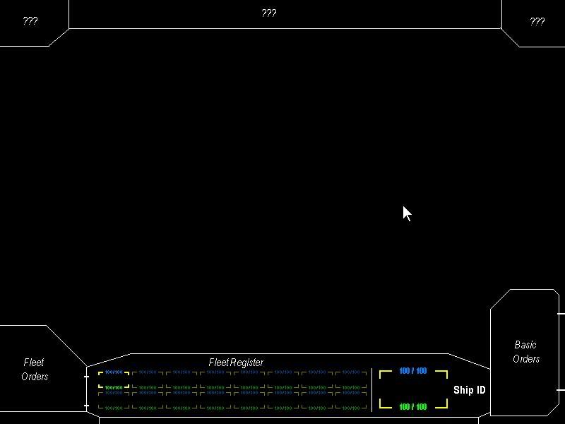
kinds of panels
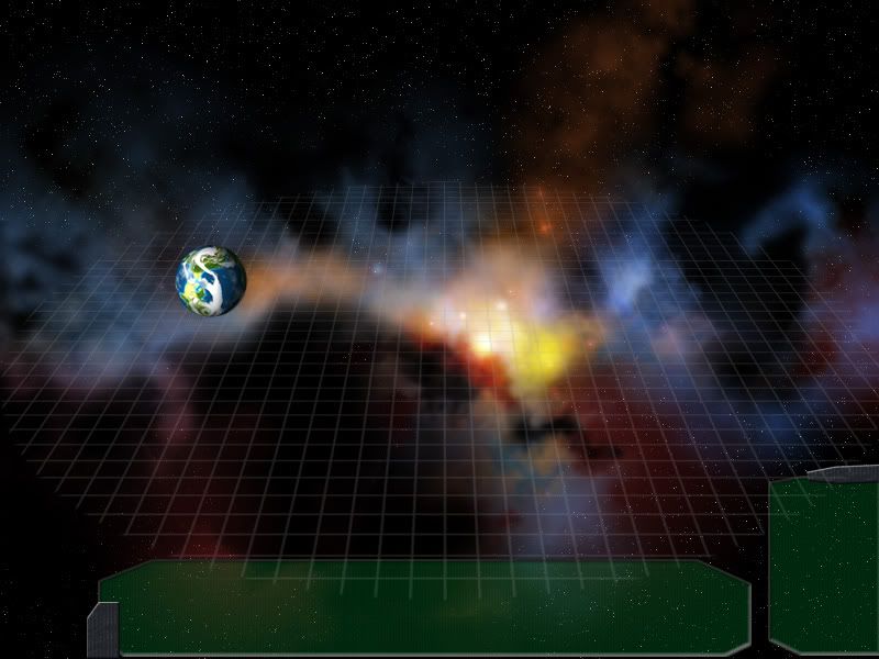
It took longer to make the nebula than the mock up :/
We can explore a set up that is even less obtrusive than what is displayed, but still gets the relevant points through. Not all information should go on panels either, and things like hit points could be displayed on the unit itself. Still, minimalism is best here, IMHO. No excel in space.
1: I think the interface should be minimalist; intimidating the player with features and buttons is the last thing we want to do. It should be easy to navigate, and only display the bare necessities (for now at least)
2: The absolute necessary stuff should be first and foremost the easiest to read off the panels and info bars. This information should be easy to obtain.
3: Various hot keys should be heavily supported.
4: there shouldn't be a panel for everything; the view itself could probably support some features more intuitively anyways.
I'm not sure what else to add, because I don't know what else FO itself has to offer. Here are a couple of pictures I drew up for an 800x600 scale window.
kinds of panels
It took longer to make the nebula than the mock up :/
We can explore a set up that is even less obtrusive than what is displayed, but still gets the relevant points through. Not all information should go on panels either, and things like hit points could be displayed on the unit itself. Still, minimalism is best here, IMHO. No excel in space.
Re: 0.4 combat UI
It's a nice start, as far as one can say. It's probably equally hard to critique, as it is to create it at this point. I would probably restrain from any kind of fancy UI element. Just use normal windows, lists and such - elements we already have. Polishing the UI, that might involve "skinning" is done at 0.9.
My guess is, that the combat UI will be created parallel to the actual coding and depend on what functionality tzlaine provides to us. Hopefully there will be many tech demos or frequent release candidates.
My guess is, that the combat UI will be created parallel to the actual coding and depend on what functionality tzlaine provides to us. Hopefully there will be many tech demos or frequent release candidates.
-
eleazar
- Design & Graphics Lead Emeritus
- Posts: 3858
- Joined: Sat Sep 23, 2006 7:09 pm
- Location: USA — midwest
Re: 0.4 combat UI
I do think a grid is a good idea.